2 Descriptive Statistics
In the previous chapter, I have mentioned that there are (i) descriptive statistics that describes the sample data we collected, and (ii) inferential statistics that helps us make conclusions about the population using the sample. In this chapter, we will learn about basic descriptive statistics and methods to summarize the sample data.
There are two main ways to summarize the data: visual presentation (plots) and numeric summary. The type of plots and numeric summaries differ based on the type of the data variables that we are considering.
2.1 Types of Variables
We have discussed briefly in the last lesson that there are two types of variables: quantitative or qualitative. The table below gives a more detailed comparison between these two types of variables.
| Quantitative (numeric) variable | Qualitative (categorical) variable |
|---|---|
| - Takes on numeric values | - Takes on levels/categories |
| - Quantifies some aspect of an individual or object | - Qualifies some aspect of an individual or object |
| - Can be further classified as discrete or continuous | - Can be further classified as ordinal (have a natural ordering) or non-ordinal |
| - Can be binary (two levels) or categorical (more than two levels) | |
| - Examples include: Time, Height, Weight, Age, Temperature, Price, etc. | - Examples include: Color, Race, Gender, Province, Faculty, Blood type, etc. |
2.2 Summaries of Qualitative Variables
2.2.1 Frequency
Qualitative variables can be summarized by
frequency: the number of units/observations (the count) in each category
relative frequency: the proportion of observations in each category \[\frac{\text{frequency}}{\text{total number of observations}}\]
precentage relative frequency: the relative frequency expressed as a percentage \[\frac{\text{frequency}}{\text{total number of observations}}\times 100\%\]
2.2.2 Plots
The frequencies can be plotted using a
bar plot: can be used for comparison among categories.
The \(x\)-axis typically represents the different categories and the \(y\)-axis can then capture the frequency, relative frequency or % relative frequency.
In a bar plot, the categories can be sorted in any order. However, it is usually prefered to order the categories by some (natural) ordering for clarity.
There is usually a space in between the bars to separate the categories.
pie plot: can be used to show the composition of the variable (i.e., share of total of each category).
- Typically the (percentage) relative frequency of each category is plotted within a circle so that the area for each category adds up to the area of the whole circle (100%)
Notes: It is best to illustrate these plots using an example. We will continue the students’ rent example in Chapter 1. And from this chapter, we will work with the data set fakeRent.csv. We will assume that this data set records the sample I collected to study UWaterloo students’ rent6. Learn more about the data set in Appendix C.
From this chapter, we will also include R codes and examples to illustrate concepts and help you analyze real data sets in your future. Learn about R in Appendix A.
Example 2.1 Suppose I am interested in the faculty of students in the sample I collected in the fakeRent.csv data set. I can open the file in Excel and calculate the frequency and relative frequency as follows
| Faculty | Frequency | % Relative frequency |
|---|---|---|
| Arts | \(160\) | \(\frac{160}{1345}\times 100 = 11.9\) |
| Engineering | \(246\) | \(18.3\) |
| Environment | \(125\) | \(9.3\) |
| Health | \(199\) | \(14.8\) |
| Math | \(376\) | \(27.9\) |
| Science | \(239\) | \(17.8\) |
| Total | 1345 | 100 |
Or I can calculate the frequency and % relative frequency in R with the following code
# calculate the frequency table and save it as "fac.freq" in the R environment
fac.freq <- table(rent$faculty)

# print the frequency table
fac.freq
##
## Arts Engineering Environment Health Math Science
## 160 246 125 199 376 239# calculate the relative frequency table and save it as "fac.relfreq" in the R environment
fac.relfreq <- table(rent$faculty)/nrow(rent) #nrow(rent) gives the number of students observed in the "rent" data set
# print the relative frequency table
fac.relfreq##
## Arts Engineering Environment Health Math Science
## 0.1189591 0.1828996 0.0929368 0.1479554 0.2795539 0.1776952Using these frequency tables, we can plot a bar plot in R.
# plot the bar plot of the calculated frequency table
bp <- barplot(fac.relfreq,                             # frequency table
        space = 0.5,                                   # space in between the bars
        cex.names = 0.6,                               # font size of bar names in the x-axis
        ylim = c(0, 0.32),                             # limits for y-axis
        ylab = "% Relative frequency",                 # label of the y-axis
        main = "Bar plot for the faculty of students") # title of the plot

# annotate numbers at the top of the barplot
text(bp,                                           # the barplot
     fac.relfreq+0.02,                             # positions of the numbers
     labels=paste0(round(fac.relfreq*100, 1),"%"), # the numbers, as percentage
     cex=0.8)                                      # size of the annotated numbers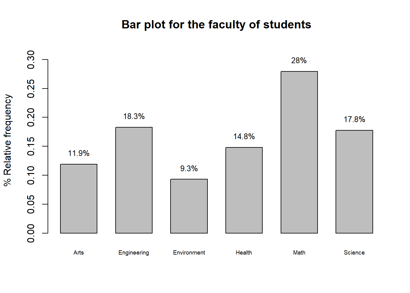
Figure 2.1: Bar plot of students’ faculties in the sample data
We can also create a pie plot.
# create the pie plot
pie(fac.relfreq,                                    # the frequency table
    labels = paste0(round(fac.relfreq*100, 1),"%"), # the number annotated in the pie plot
    clockwise = TRUE,                               # whether the pie will plot the data clock-wise
    col = c("red", "orange", "yellow",
            "green", "blue", "violet"),             # colors of the pie slices
    main = "Pie plot of faculty")                   # title of the plot

# drawing a legend in the plot
legend("bottomleft",                       # position of the legend relative to the plot
       legend = names(fac.relfreq),        # names of the pie slices (i.e., the column names of the frequency table)
       fill = c("red", "orange", "yellow",
            "green", "blue", "violet"),    # colors of the pie slices
       cex = 0.7)                          # size of the legend's words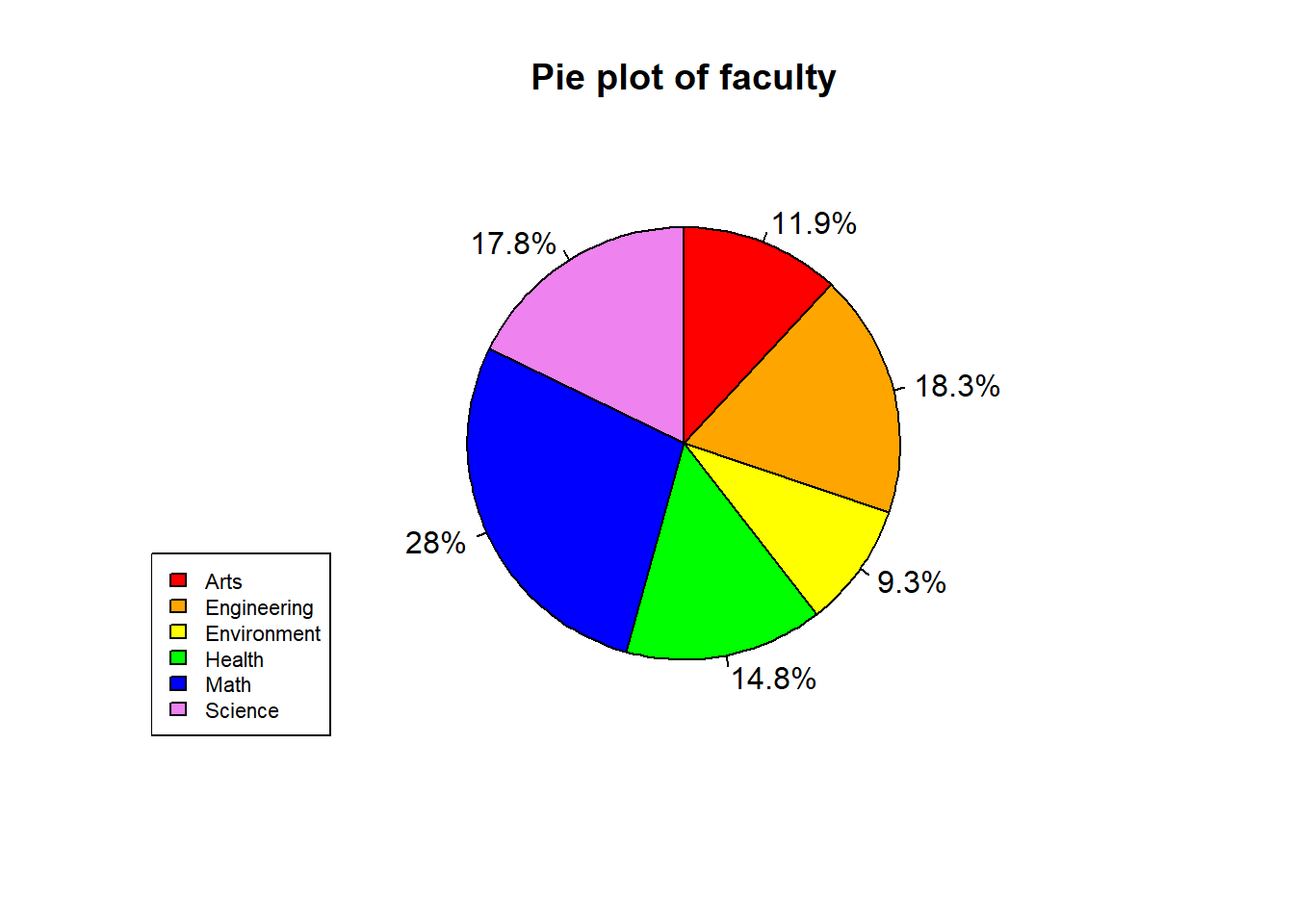
Figure 2.2: Pie plot of students’ faculties in the sample data
To present data about two qualitative variables, we can plot a side-by-side or a stacked bar plot.
Example 2.2 Now, suppose that I am interested in both students’ faculty and gender. I can calculate a two-way frequency table.
# calculate a two-way frequency table by gender and faculty and save it as an object called "fac.gender" in R environment
fac.gender <- table(rent$gender, rent$faculty)

# print the calculated frequency table
fac.gender
##
## Arts Engineering Environment Health Math Science
## Female 80 52 58 104 133 73
## Male 63 157 46 62 177 120
## Others 17 37 21 33 66 46The side-by-side bar plot of students’ faculty and gender can be plotted using the following R code:
# create a side-by-side bar plot
bp2 <- barplot(fac.gender,
               cex.names = 0.6,
               ylab = "frequency",
               main = "Number of students by faculty and gender",
               beside = TRUE,                     # whether the bar plot is side-by-side
               col = c("red", "green", "yellow"), # colors of the different genders
               ylim = c(0, 190))

# add text annotation to the bar plot
text(bp2,
     fac.gender+8,
     fac.gender,    # now the numbers are the counts instead of percentages, because fac.gender is a frequency table, not a % relative frequency table as in Figure 2.1
     cex=0.8)

# add a legend to the bar plot
legend("topleft",
       legend = rownames(fac.gender),
       fill = c("red", "green", "yellow"),
       cex = 1)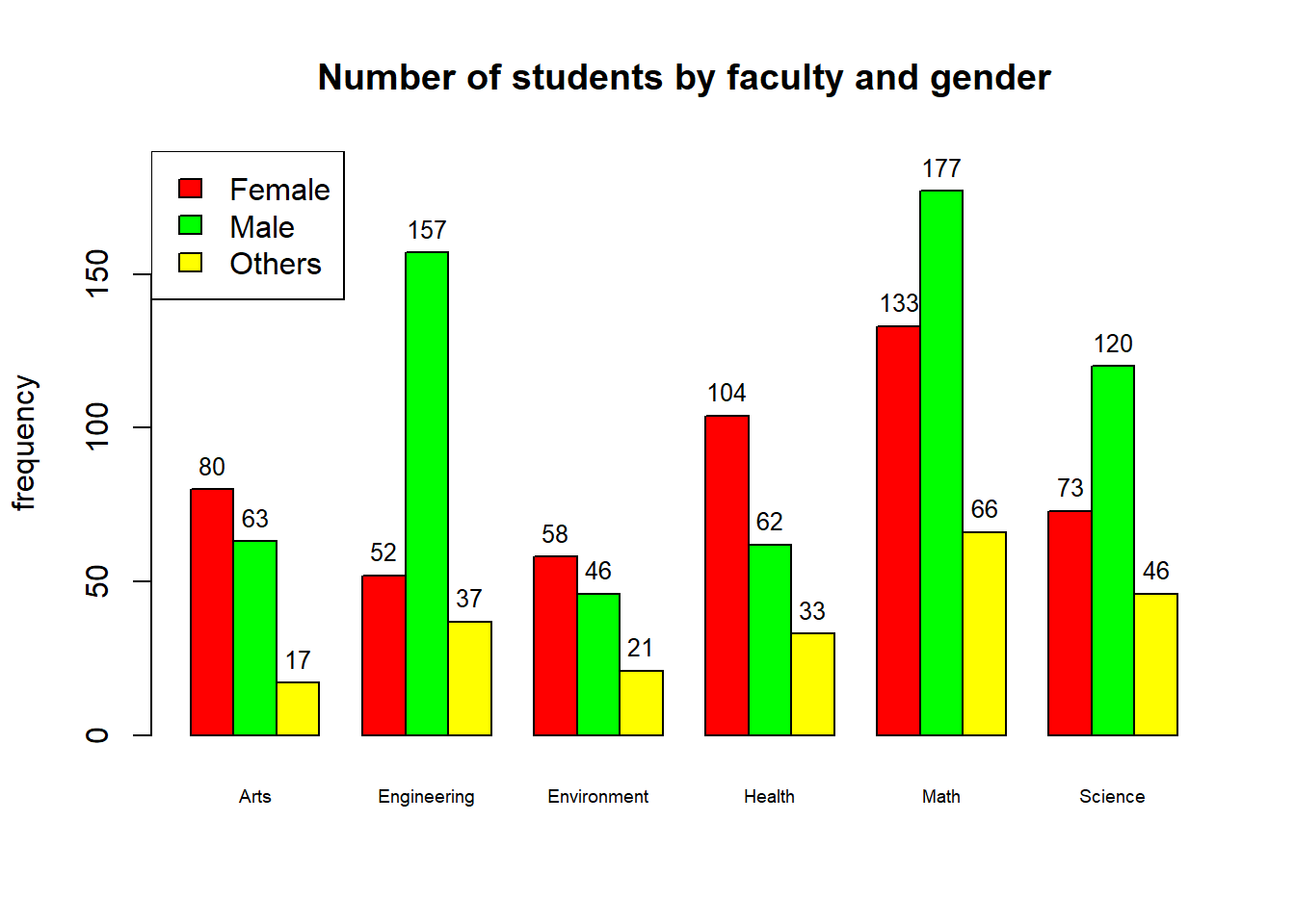
Figure 2.3: Counts of students by faculty and gender
From the plot, we can see that there are some faculties where the number of males is more than that of females and on the other hand, there are faculties where the opposite applies. Remember that this result is only reflecting the sample that I collected, it does not necessarily reflect the real distribution of students in the population. That is the case only when our sample is large and representative of the population.
To plot a stacked bar plot, change the beside argument from TRUE to FALSE. However, it is not straightforward to annotate the numbers into the stacked bar plot. Look at the code below.
# create a side-by-side bar plot
bp2 <- barplot(fac.gender,
               cex.names = 0.6,
               ylab = "frequency",
               main = "Number of students by faculty and gender",
               beside = FALSE, # now the bar plot is stacked instead of side-by-side
               col = c("red", "green", "yellow"),
               ylim = c(0, 500))

# calculate tables to input as annotated texts in the plot
fac.gender.txt <- t(fac.gender)

# function to calculate the the y-coordinate at the middle of each stacked bar
# you do not need to understand this function in details, just run the code
stacked_position <- function(mat) {
  ret <- mat
  for (i in 1:ncol(mat)) {
    if (i == 1) {
      ret[,i] <- mat[,i]/2
    } else {
      ret[,i] <- ret[,i-1] + mat[,i-1]/2 + mat[,i]/2
    }
  }
  ret
}

# calculate the position of the annotated texts in the plot using the stacked_position function defined above
fac.gender.txt.position <- stacked_position(fac.gender.txt)

# add text annotation to the bar plot
text(bp2,
     fac.gender.txt.position,
     fac.gender.txt,
     cex=0.8)

# add a legend to the bar plot
legend("topleft",
       legend = rownames(fac.gender),
       fill = c("red", "green", "yellow"),
       cex = 1)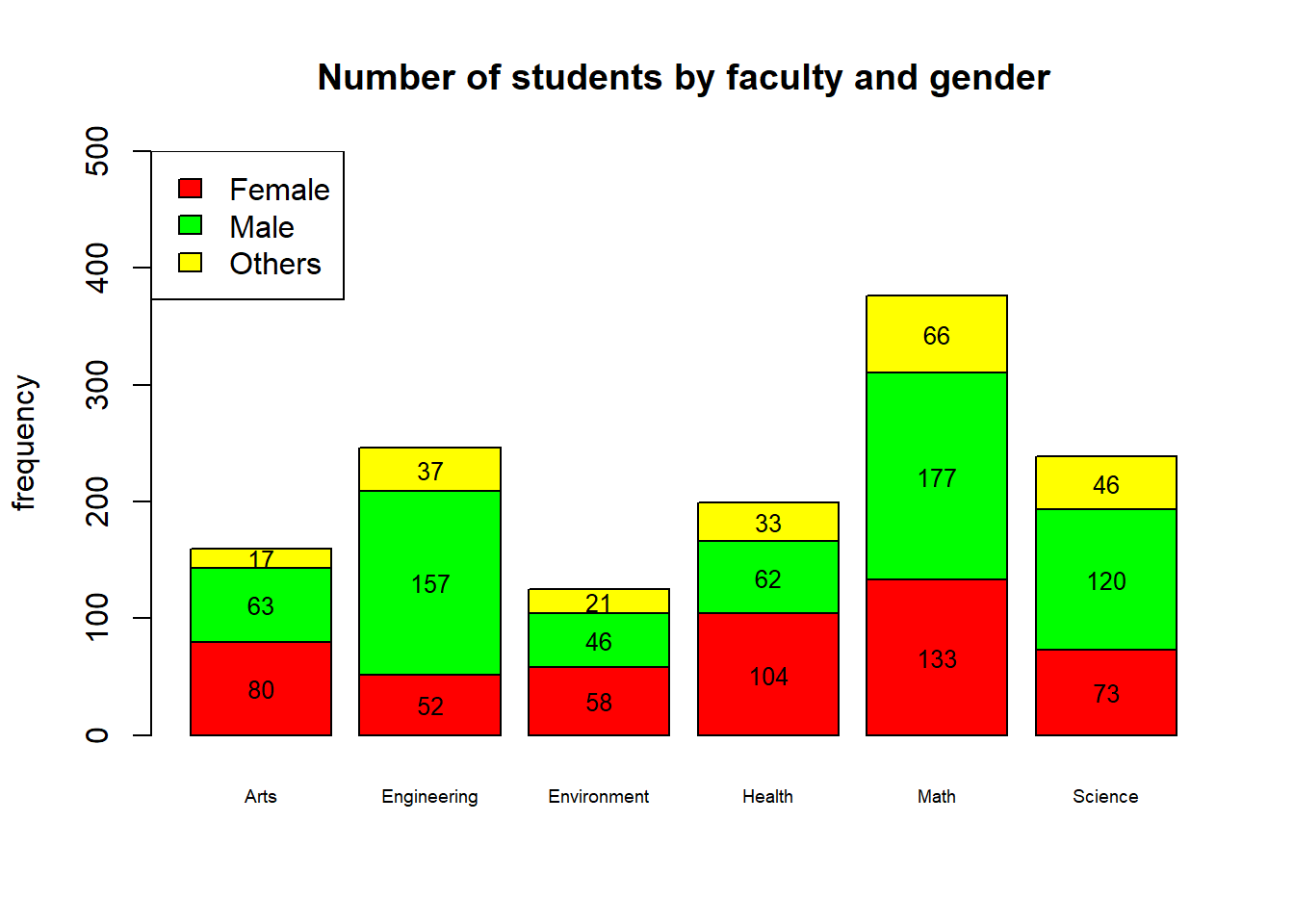
Figure 2.4: Counts of students by faculty and gender
Exercise 2.1
- When will the data I collect likely represent the real distribution of students in UWaterloo?
- Recreate the stacked bar plot but with % relative frequency instead of frequency table.
2.3 Summaries of Quantitative Variables
2.3.1 Stem Plots
For a small sample size (small number of sampled observations), one quantitative variable can be presented using a stem (or stem-and-leaf) plot.
Example 2.3 Consider the first 24 students in the fakeRent.csv data set. Their rents are
\[\begin{array}{cccccccc} 890 & 1120 & 590 & 830 & 910 & 940 & 550 & 850 \\ 930 & 1040 & 860 & 720 & 1020 & 540 & 680 & 700 \\ 760 & 730 & 730 & 910 & 960 & 350 & 940 & 710 \end{array}\]
The stem plot for this 24 observations can be plotted in R using the following code:
# save the first 24 rent data into a variable called "dat" in the R environment
dat <- rent$rent[1:24]

# create the stem plot
stem(dat,         # the data to be plotted
     scale = 2)   # scale = 1 gives even-numbered stems, scale = 2 gives all available stems
##
## The decimal point is 2 digit(s) to the right of the |
##
## 3 | 5
## 4 |
## 5 | 459
## 6 | 8
## 7 | 012336
## 8 | 3569
## 9 | 113446
## 10 | 24
## 11 | 2There are three parts in a stem plot:
legend: the legend tells us about the number of digits that the decimal point is to the right of |. In other words, this tells us how the number is split. In the previous example, the legend says that the decimal point is two digits to the right of |. For example, consider the first number in the plot

To know the first number, we start by placing the decimal point at the | then move it to the right or left as specified in the legend. In the above picture, we move the decimal point two digits to the right and get 350.0
stem: is the number to be used to categorize the observations. In Example 2.3, the stem is the hundred.
leaves: each leaf represents an observation in our data set. In a stem plot the leaves are ordered in ascending order.
From the plot in Example 2.3, we can see that there are some “leaves” that are repeated twice. This means that there are two observations having the same value. In the above plot, these are 730, 910, 940.
The stem plot is
pros: easy to create and individual observations (data points) are maintained.
cons: not practical when data set is large.
2.3.2 Quantiles
An \(x\)-quantile of a distribution is the value at which \(x\) of the data lies below this value.
A \(x\)-percentile of a distribution is the value at which \(x\) percent of the data lies below this value.
For example, a \(0.5\)-quantile (\(50\%\)-percentile) is the value at which 50% of the data lies below this value, i.e., half of the data lies below this value and the other half of the data lies above this value. The \(0.5\)-quantile is an important descriptive quantity and is called the median of a distribution.
To find the median, we follow the following steps. Suppose we have \(n\) observations, then
Sort the data from the smallest to largest
If \(n\) is odd, then the median is the value at the \(\frac{n+1}{2}\)th position
If \(n\) is even, then the median is the average of the \(\frac{n}{2}\)th and \((\frac{n}{2}+1)\)th value.
Example 2.4 Consider again the first 24 values of rent in Example 2.3. The stem plot helped me sort the values. Now since I have \(n=24\) observation, according to step 3, the median will be the average between the \(\frac{24}{2}=12\)th and the \(12+1 = 13\)th position. Those are the numbers highlighted in the above stem plot: \(830\) and \(850\). The median is \[\frac{830+850}{2} = 840.\]
If I omit the last observation of the data in Example 2.4, i.e., \(710\), what will be the median of my data now?
Generally, to find \(x\)-quantile, we follow the following steps
Sort the data from smallest to largest
The position of interest is \(n \times x\).
If this number is not an integer, we round this up to the next whole number. The value in that position is our \(x\)-quantile.
If this number is an integer, the \(x\)-quantile is the average of the values in position \(n \times x\) and \(n \times x + 1\).
Example 2.5 Consider the sorted data (\(n=12\))
\[35, 54, 55, 59, 68, 70, 71, 72, 73, 73, 76, 80\]
Suppose we want to find the \(0.3\)-quantile. The position of our interest will then be \(12 \times 0.3 = 3.6\). Because this is not an integer, we need to round this up and take the value at the \(4\)rd position. So the \(0.3\)-quantile is \(59\). We can also calculate this in R.
# save the data into a variable called "dat"
dat <- c(35, 54, 55, 59, 68, 70, 71, 72, 73, 73, 76, 80)

# calculate the 0.3-quantile
quantile(dat,         # the data whose quantile is to be calculated
         probs = 0.3, # the probability at which the quantile is calculated
         type = 2)    # the type of quantile-finding algorithm to use
## 30%
## 59Now suppose we want to find the \(0.75\)-quantile. The position of interest is \(12 \times 0.75 = 9\), which is an integer. We then take the average of the values in the \(9\)th and \(10\)th position, i.e., \((73+73)/2 = 73\). The R code is then
## 75%
##  73
2.3.3 Five-number Summary
Besides the median, there are two other important quantiles that are usually used in statistics: the \(25\) and \(75\) percentiles (or the \(0.25\)- and \(0.75\)-quantiles). We call
the \(25\) percentile the first quartile, and denote it by Q1,
the median, i.e., the \(50\) percentile, the second quartile and denote it by Q2,
the \(75\) percentile the third quartile, and denote it by Q3.
Example 2.6 Continue with Example 2.4.
Q1 is the \(0.25\)-quantile, so the position we are looking for is \(24\times 0.25 = 6\). Because this is an integer, we take the average of the values at the \(6\)th and the \(6+1 = 7\)th position, which gives us \[Q1 = \frac{700+710}{2} = 705.\]
Q3 is the \(0.75\)-quantile, so the position we are looking for is \(24\times 0.75 = 18\). Because this is an integer, we take the average of the values of the \(18\)th and the \(19\)th position, which is 930 and 940. Then Q3 is \[Q3 = \frac{930+940}{2} = 935.\]
Q1, Q2 (the median) and Q3, together with the minimum and the maximum value, are called the five-number summary of the variable. The five-number summary roughly tells us about the distribution of the variable.
Example 2.7 In the above Example 2.6, the five-number summary of the \(24\) observations of student rent is
Minimum: \(350\)
Q1: \(705\)
Median (Q2): \(840\)
Q3: \(935\)
Maximum: \(1120\)
2.3.4 Box Plots
Box plots helps us represent the distribution of a quantitative variables using the five-number summary.

Figure 2.5: Elements of a box plot
To draw a box plot, we follow the following steps
calculate the five-number summary of the data,
draw a box from Q1 to Q3, draw a line at Q2
calculate the interquartile range (IQR) \[IQR = Q3 - Q1\]
calculate the upper (UL) and lower limits (LL)
\[\begin{align*} LL & = Q1 - 1.5 \times IQR \\ UL & = Q3 + 1.5 \times IQR \end{align*}\]
draw the upper whisker up until the maximum value which is smaller than the UL,
draw the lower whisker up until the minimum value which is larger than the LL,
sometimes dotted lines are drawn at the UL and the LL,
denote any point outside the whiskers by dot(s). These points are called the outliers, i.e., the extreme values when compared to the other values in the data.
Example 2.8 Consider again the data in Example 2.3. From Example 2.7, we know the five-number summary
Minimum: \(350\)
Q1: \(705\)
Median (Q2): \(840\)
Q3: \(935\)
Maximum: \(1120\)
The interquartile is \[IQR = 935-705 = 230\]
LL and UL are \[LL = Q1 - IQR \times 1.5 = 705-230 \times 1.5 = 360\] \[UL = Q3 + IQR \times 1.5 = 935+230 \times 1.5 = 1280\]
The maximum value smaller than UL is \(1120\).
The minimum value larger than LL is \(540\).
We can draw the box plot as follows
# save the first 24 students' rent into an object called "dat"
dat <- rent$rent[1:24]

# draw the box plot
boxplot(dat,                                 # data to be plotted
        main = "Box plot of students' rent", # title of the plot
        xlab = "rent",                       # label of the x-axis
        horizontal = TRUE)                   # whether the box plot is horizontal or vertical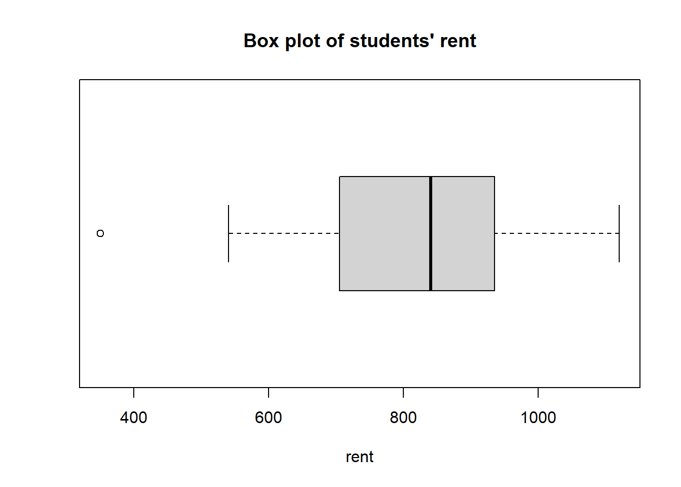
Figure 2.6: Box plot of rents for the first 24 students in the data set
We can also draw side-by-side box-plots to compare the distribution of a quantitative variable across different categories of a qualitative variable.
Example 2.9 Suppose we want to compare the rent between different genders.
boxplot(rent~gender,        # box plot of rent column by gender column in the rent data set
        data = rent,        # the data set to be plotted from
        xlab = "rent",
        horizontal = FALSE,
        main = "Box plot of students' rent")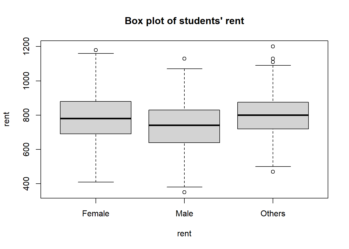
Figure 2.7: Box plot of students’ rents by gender
We can see from the plot that male students seem to pay less rent than other genders. Again, this is just an observation in our sample, we should not carelessly generalize this conclusion to the whole population.
2.3.5 Histogram
Another great way to view the distribution of quantitative data is to plot a histogram. The histogram is the analogue of bar plots for quantitative data, in which the categories are intervals of values and the height of the bars are the frequency or the (percentage) relative frequency of values that lie within the intervals. In a histogram, these intervals (categories) are called the bins.
Conventionally, we design the bins so that they cover the whole range of the variable (i.e., from the minimum to the maximum) and the the bins (intervals) are of the same length. Usually, we divide the range into 5 to 20 bins.
Note that there is no gap in between the bins of a histogram (in contrast to the bar plot for qualitative data). This shows the continuity of scale of quantitative variables.
Example 2.10 To draw a histogram of rent in the fakeRent.csv data, we use the code
hist(rent$rent,   # data to be plotted
     breaks = 10, # number of breaks to divide the range into bins of equal length
     main = "Histogram of students' of rent",
     xlab = "rent")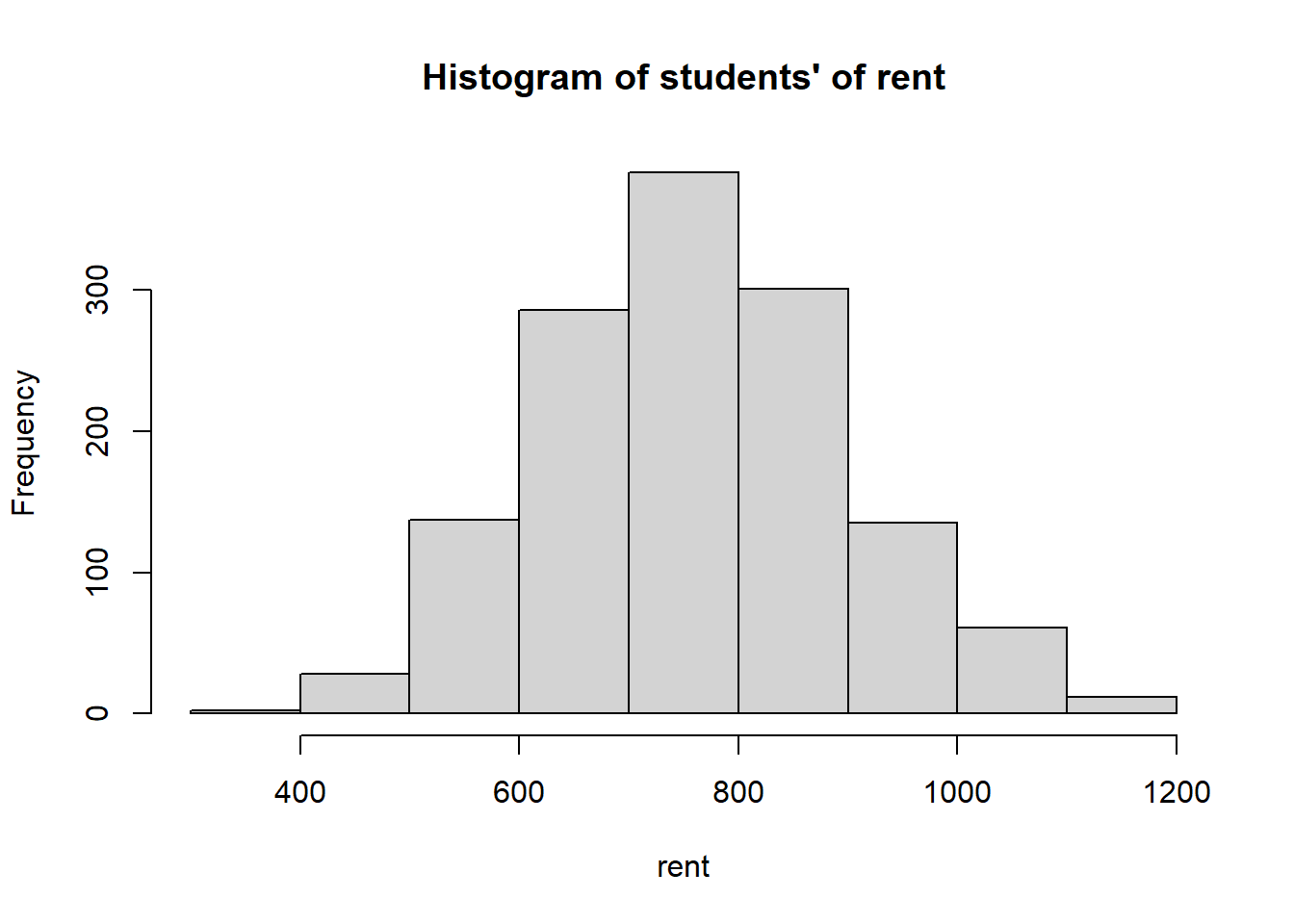
Figure 2.8: Histogram of students’ rent
In first plot (Figure 2.8), there are 9 bins. We can zoom more closely into the data by drawing another histogram using more bins (Figure 2.9).
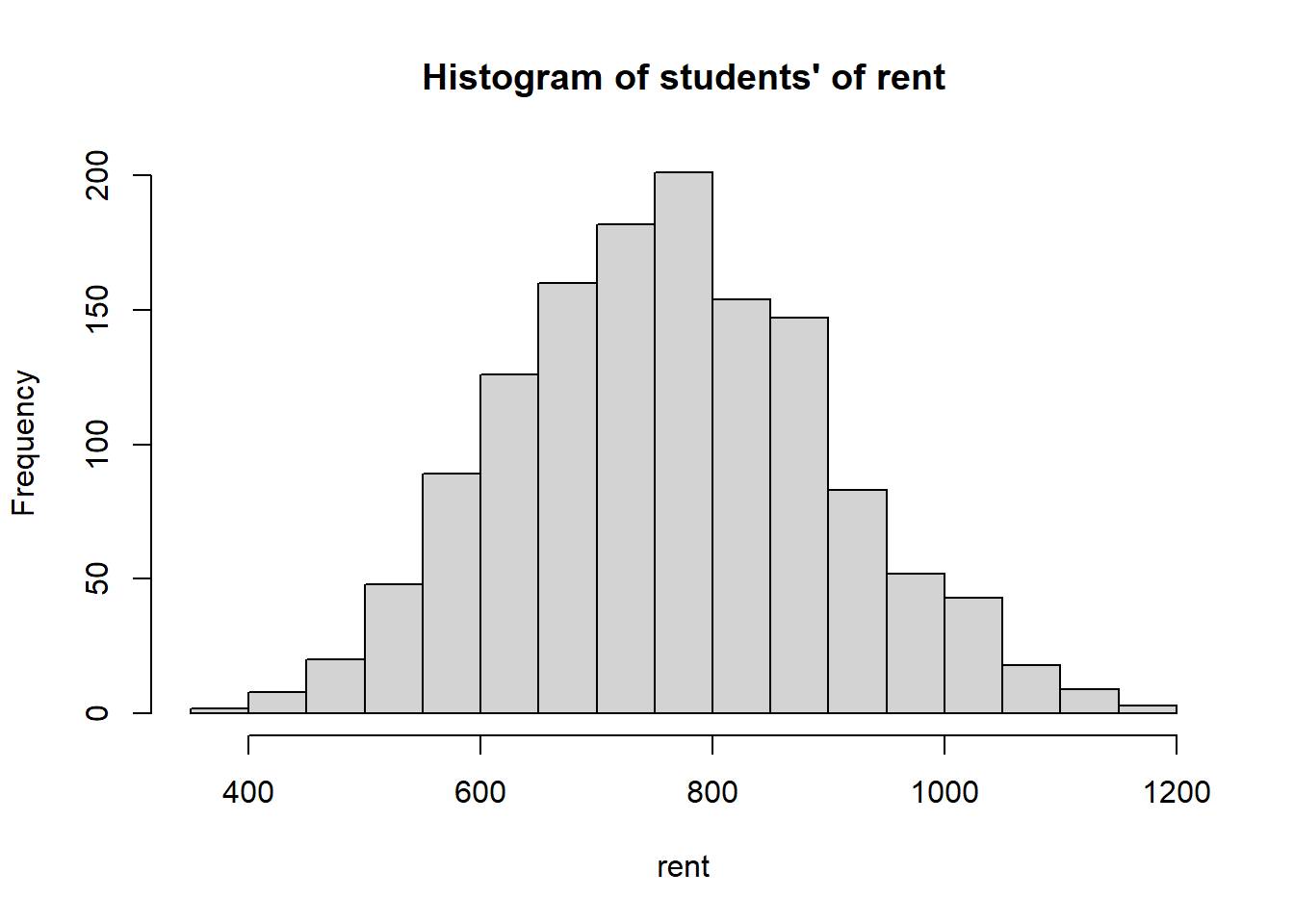
Figure 2.9: Histogram of students’ rent
Histogram’s advantages and disadvantages:
pros: visually summarize data in a nice way. With histograms, we can get an idea about the
center: the “middle point” of the distribution
spread of the distribution
shape of the distribution
outliers: extreme observations that fall outside of the common range of other observations.
cons: unlike the stem plots, we cannot know the exact value of an observation in histograms.
2.3.6 Measure of Centrality
A measure of centrality is a numeric summary which gives us one value that lies in the center of the whole distribution. There are three common centrality measures
mode: the value that is most popular in the data,
the value that most individuals/units have may be a candidate the represent the whole distribution.
you will see that even though the rationale of the mode is sound, it is the least popular because
there can be more than one modes
there is no universal formula to calculate the mode for all distribution,
it is not always representative and informative.
median: the point that divides the data into two halves. (We discussed this in the Section 2.3.2 )
the median lies in the middle of the distribution and it gives us a sense of the “middle point”.
even though this one is more popular than the mode, it is still less popular than the mean because
there is a universal algorithm to find the median
but the algebra is not nice (for anyone familiar with calculus, the formula of the median is usually not smooth7).
mean: the average (or “arithmetic mean”) of the data,
suppose the data I collect the data \(x_1, x_2, ..., x_n\) (\(n\) observations), then the mean is \[\frac{x_1+x_2 + ... + x_n}{n}\]
notation: \(\bar{x}\)
the mean is the closest to all other values on average and it is the middle of the values
this is the most popular measure of centrality because
there is a universal formula to find the mean
the algebra is nice
the mean has good properties that we will look at in Chapter 6.
Example 2.11 Come back to the data in Example 2.3
\[\begin{array}{cccccccc} 890 & 1120 & 590 & 830 & 910 & 940 & 550 & 850 \\ 930 & 1040 & 860 & 720 & 1020 & 540 & 680 & 700 \\ 760 & 730 & 730 & 910 & 960 & 350 & 940 & 710 \end{array}\]
The mode is the value that appears most of the time. As we discussed in Example 2.3, there are 3 values that repeats two times: \(730\), \(910\), \(940\). These are the modes of the distribution. As it shows in this example, the mode is usually not informative about the centrality of the distribution.
The median is \(840\) as we discussed in Example 2.4.
The mean is \[\frac{890 + 1120 + 590 + ... + 940 + 710}{24} = 802.5\]
Example 2.12 We can calculate the mean, median, and modes using R
## [1] 767.0409## [1] 760## 50%
## 760# a function to calculate the modes
# you do not need to understand the function in details, just run the code
stat_mode <- function(vec) {
vals <- unique(vec)
counts <- sapply(1:length(vals), function(i) {sum(vec == vals[i])})
vals[which(counts == max(counts))]
}
# mode of the rent
stat_mode(rent$rent)## [1] 7202.3.7 Measure of Variability
The variability or dispersion of a variable gives us a sense of the spread (i.e., how different the values in our data are) of the distribution of that variable. Some measures of variability is
range: distance between the largest and the smallest value in the data set
Formula: Range = Maximum value - Minimum value
this gives us the range of all the values in our data
interquartile range (IQR): the distance covered by the middle 50% of the data
Formula: IQR = Q3 - Q1
this gives us the range of the central values in our data
standard deviation:
this gives us the average difference of the values from the mean
notation: \(s\)
suppose we have the data \(x_1, x_2, ..., x_n\)
one may think that we can simply average the differences \[\frac{(x_1 - \bar{x}) + (x_2-\bar{x}) + ... + (x_n-\bar{x})}{n} = \frac{\sum_{i=1}^n (x_i-\bar{x})}{n},\] however, if you pay closer attention, this formula will always be zero no matter what the values \(x_1, x_2, ..., x_n\) are. This means this formula will not give us any information about the spread of the distribution.
another viable option is to take the absolute value of the differences \[\frac{|x_1 - \bar{x}| + |x_2-\bar{x}| + ... + |x_n-\bar{x}|}{n} = \frac{\sum_{i=1}^n |x_i-\bar{x}|}{n}.\] This is a good option, but the algebra is not nice (i.e., again not smooth)
finally, we can choose to square the differences, calculate the average then take the square root. In fact, this is the formula of the standard deviation \[\begin{align*} s & = \sqrt{\frac{\sum_{i=1}^n (x_i-\bar{x})^2}{n-1}} \\ & = \sqrt{\frac{(x_1 - \bar{x})^2 + (x_2-\bar{x})^2 + ... + (x_n-\bar{x})^2}{n-1}} \\ & = \sqrt{\frac{\sum_{i=1}^n x_i^2 - n\bar{x}^2}{n-1}}. \end{align*}\]
the variance is just the square of the standard deviation
\[s^2 = \frac{\sum_{i=1}^n (x_i-\bar{x})^2}{n-1}\]
-
you may wonder why we divide by \(n-1\) instead of \(n\). We will explain this in later chapters.
the variance and the standard deviation are always positive.
the standard deviation, the mean, mode and median all have the same unit as the raw data. For example, the standard deviation of the rent data will be in dollars ($).
the variance has the unit squared. In the rent data, the unit of the variance is \(\$^2\).
Example 2.13 Again consider the data in Example 2.3
\[\begin{array}{cccccccc} 890 & 1120 & 590 & 830 & 910 & 940 & 550 & 850 \\ 930 & 1040 & 860 & 720 & 1020 & 540 & 680 & 700 \\ 760 & 730 & 730 & 910 & 960 & 350 & 940 & 710 \end{array}\]
From Example 2.11, the mean is \(\$ 802.5\).
The variance is
\[\begin{align*} s^2 & = \frac{\sum{i=1}^24 x_i^2 - 24\bar{x}^2}{24-1} \\ & = \frac{[890^2 + 1120^2 + ... + 940^2 + 710^2] - [25\times 802.5^2]}{25-1} \\ & = 32880.43 \quad (\$^2) \end{align*}\]
The standard deviation is \[s = \sqrt{32880.43} = 181.3296 \hspace{2mm} (\$)\]
We can also calculate the variance and standard deviation in R.
Exercise 2.2 Prove that for all data \(x_1, x_2, ..., x_n\) the following hold
\[\frac{\sum_{i=1}^n (x_i-\bar{x})}{n} = 0\]
\[s^2 = \frac{\sum_{i=1}^n x_i^2 - n\bar{x}^2}{n-1}\]
where, by the formula,
\[\begin{align*} \bar{x} & = \frac{\sum_{i=1}^n x_i}{n}, \\ s & = \frac{\sum_{i=1}^n (x_i-\bar{x})^2}{n-1}. \end{align*}\]
2.3.8 Shape of the Distribution
The stem plots, box plots, histograms help us understand the shape of the distribution. We can describe the shape of the distribution using the number of modes and the skewness of the distributions.
2.3.8.1 Number of Modes
A distribution can be
unimodal: the data is piled around a single peak
bimodal: the data is piled around two peaks
multimodal: the data is piled around multiple peaks

Figure 2.10: The number of modes.
2.3.8.2 Skewness
There are three types of skewness
symmetric:
a distribution is symmetric if the right and the left of the distribution are approximately mirror images of each other
the values are distributed equally around the center
we have: Mean = Median = Mode

Figure 2.11: Symmetric distribution
left-skewed
a distribution is skewed to the left if the left side extends further out than the right side, i.e., the distribution has a longer left tail
imagine someone pulls the left tail of a symmetric distribution to the right
half of the observations spread on the left side and the other half of the observations concentrate on the right of the distribution, so the median is on the right of the value range.
we have: Mean < Median
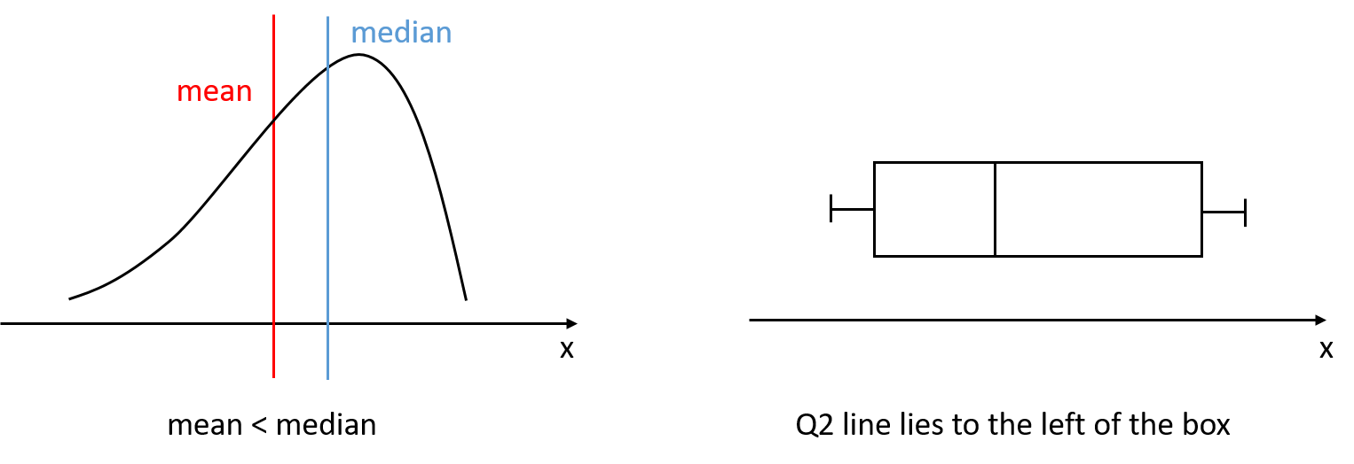
Figure 2.12: Left-skewed distribution
right-skewed
a distribution is skewed to the right if the right side extends further out than the left side, i.e., the distribution has a longer right tail
imagine someone pulls the right tail of a symmetric distribution to the right
half of the observations spread on the right side and the other half of the observations concentrate on the left of the distribution, so the median is on the left of the value range.
we have: Mean > Median
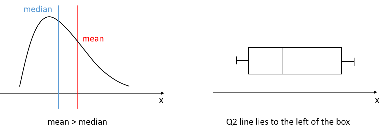
Figure 2.13: Right-skewed distribution
Example 2.15 Look at the box plot in Figure 2.6, the Q2 line is slightly to the right of the middle of the box, we can say that the distribution is slightly skewed to the left.
Look at the histograms in Figure 2.8 and 2.9, since the two tails look similar to each other, we say that the distribution is symmetric.
2.3.9 Robustness to outliers
We are introduced to outliers in Section 2.3.4 where we discuss Box plot. Recall that outliers are the extreme values that lie outside the common range of most other values in our data.
When we have outliers in our data, we should ask the question:
is the outlier produced by some error in measurement or data record?
is there another reason for such an outlier and is it interesting and worth our concern?
Many of the times, outliers are produced by errors. Because there are only a few of them, outliers will not help us generalize or make conclusions for the majority of the cases. Therefore, we usually omit the outliers from our sample.
Desirably, we want our numeric summaries (or measures, or statistics) to be robust to outliers, i.e., they will not be affected by the existence or removal of outliers.
In this lesson so far
robust to outliers: mode, median, interquartile range
not robust to outliers: mean, range, standard deviation, variance.
Notes: In this chapter we have studied two types of descriptive statistics: (i) the plots and (ii) the numeric summaries (measures). Note that these are only applicable to the data we collect, i.e., the sample. In fact, when we talk about numeric summaries of sample data, we usually add the word “sample” in front of the name of the summaries to stress that the quantities were calculated from the sample. For example, sample mean, sample median, sample standard deviation, sample variance, etc.
Since the summaries are calculated based on the collected sample, it may not be appropriate to directly generalize some results/patterns from these descriptive statistics to the population. That is, it is usually naive to say “I see this in my sample so this is what happens in the population”. However, when our sample is, as we discussed in Chapter 1, large and representative of the population, these conclusions can be made with good confidence. Again, we will understand this better when we study about inferential statistics.